Back
Back
Zala Hair
ZALA Hair is a global beauty brand specializing in premium hair extensions and styling products. Their products are sold primarily through their Shopify-based e-commerce platform, which serves a large international customer base.
Role
Product Designer
Industry
E-Commerce
PLATFORM
Web & Mobile
TIMELINE
8 weeks
Challenge
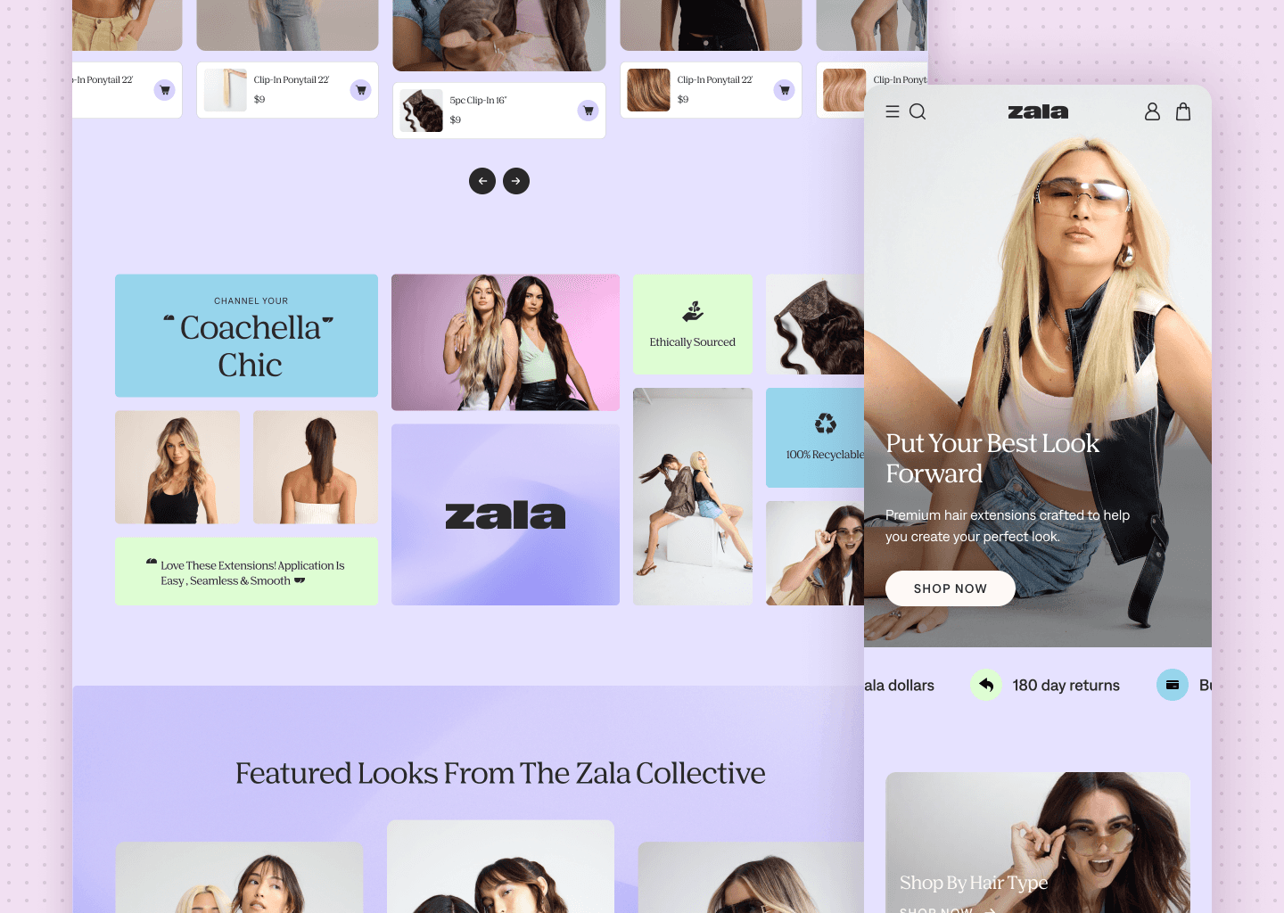
Despite strong brand recognition and high traffic, the website struggled with product discoverability, overwhelming variant selections, and drop-offs on product pages. Users found it difficult to compare lengths, shades, and collections, leading to hesitation and abandoned carts.
Product detail pages also placed important information lower in the hierarchy, which meant users had to scroll or search for key details such as length guidance, product differences, and styling inspiration. On mobile devices, these issues were amplified due to limited screen space.
These friction points created decision fatigue and contributed to users leaving product pages before adding items to their cart.
Process
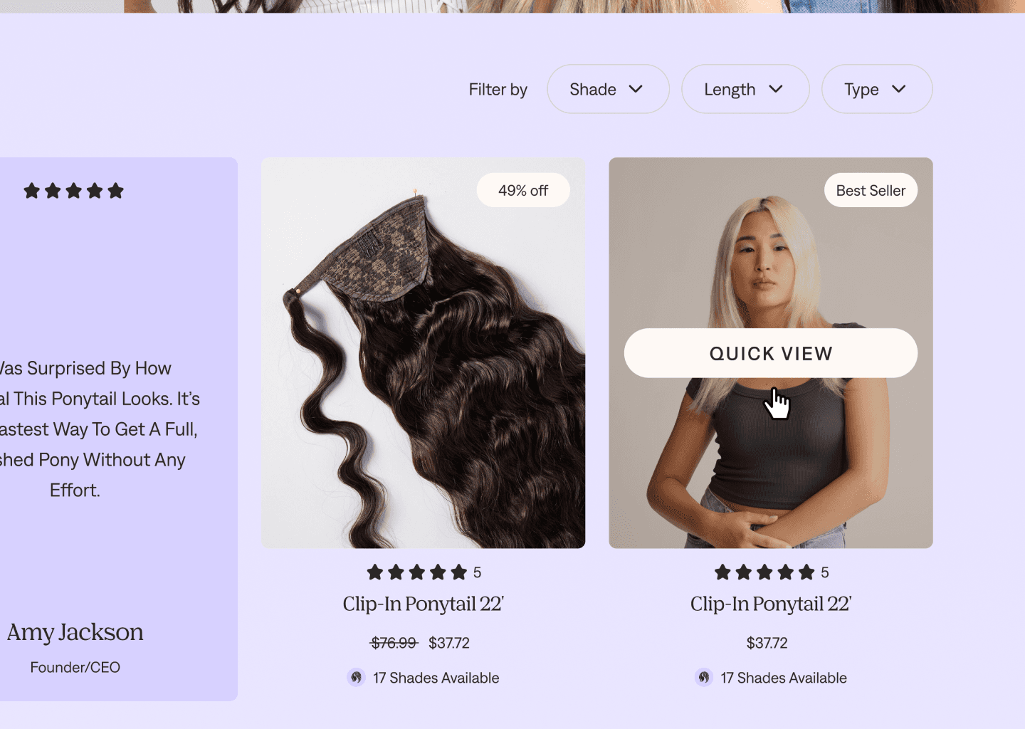
I began by conducting UX audits and reviewing Shopify analytics and behavioural data with the analytics team to identify where users were dropping off in the shopping journey. Product page bounce rates and hesitation during product selection indicated that customers needed clearer guidance when choosing extensions.
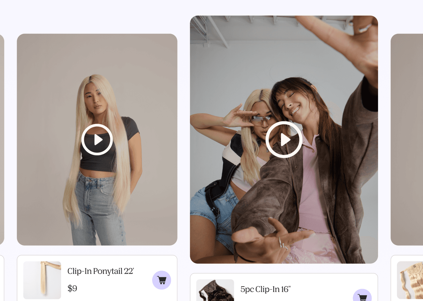
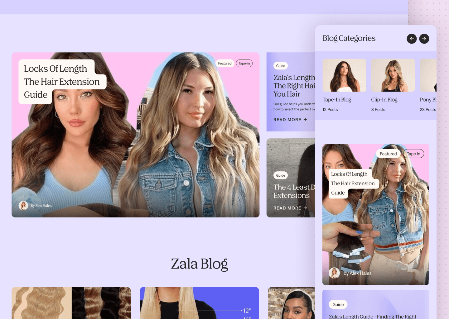
Product detail pages were redesigned to prioritize key purchase information above the fold. I introduced clearer product hierarchies, visual guides for length comparisons, and more accessible product details to help users better understand what they were purchasing.
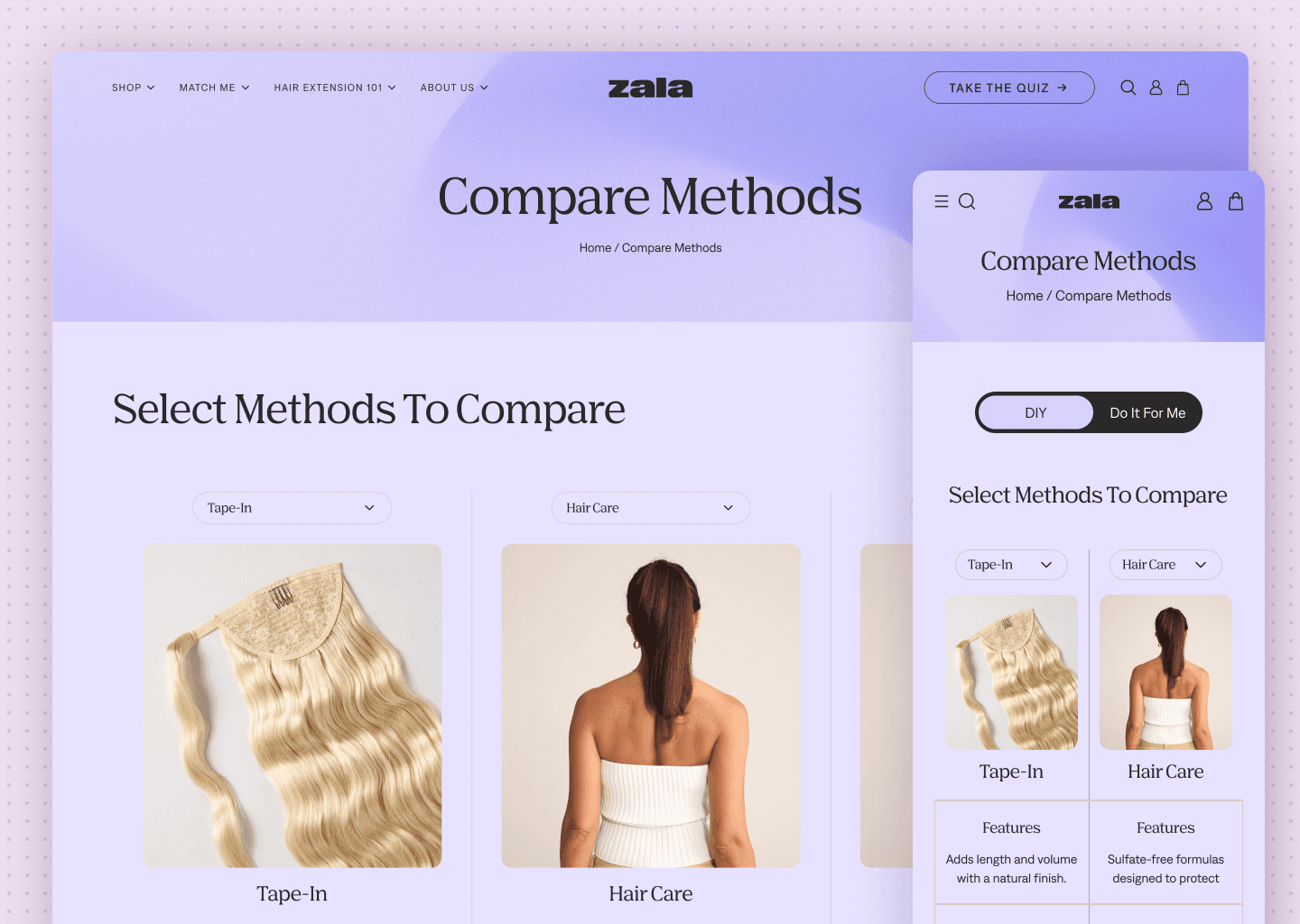
Given that a large portion of traffic came from mobile devices, I also optimized the layout for smaller screens. Variant selection and product information were reorganized into modular sections that reduced scrolling fatigue and made key actions such as add-to-cart easier to access.


Outcome
The redesign made it easier for customers to discover products, understand their options, and move through the purchase journey with less friction.
Performance was tracked through Shopify analytics before and after launch, and the data showed clear improvements. The redesigned product pages increased add-to-cart rates by an estimated 22%, while overall conversion improved by 14%.
These results reinforced how simplifying product discovery and reducing decision fatigue can have a meaningful impact on an e-commerce experience.
Back
Zala Hair
ZALA Hair is a global beauty brand specializing in premium hair extensions and styling products. Their products are sold primarily through their Shopify-based e-commerce platform, which serves a large international customer base.
Role
Product Designer
Industry
E-Commerce
PLATFORM
Web & Mobile
TIMELINE
8 weeks
Challenge
Despite strong brand recognition and high traffic, the website struggled with product discoverability, overwhelming variant selections, and drop-offs on product pages. Users found it difficult to compare lengths, shades, and collections, leading to hesitation and abandoned carts.
Product detail pages also placed important information lower in the hierarchy, which meant users had to scroll or search for key details such as length guidance, product differences, and styling inspiration. On mobile devices, these issues were amplified due to limited screen space.
These friction points created decision fatigue and contributed to users leaving product pages before adding items to their cart.
Process
I began by conducting UX audits and reviewing Shopify analytics and behavioural data with the analytics team to identify where users were dropping off in the shopping journey. Product page bounce rates and hesitation during product selection indicated that customers needed clearer guidance when choosing extensions.
Product detail pages were redesigned to prioritize key purchase information above the fold. I introduced clearer product hierarchies, visual guides for length comparisons, and more accessible product details to help users better understand what they were purchasing.
Given that a large portion of traffic came from mobile devices, I also optimized the layout for smaller screens. Variant selection and product information were reorganized into modular sections that reduced scrolling fatigue and made key actions such as add-to-cart easier to access.
Outcome
The redesign made it easier for customers to discover products, understand their options, and move through the purchase journey with less friction.
Performance was tracked through Shopify analytics before and after launch, and the data showed clear improvements. The redesigned product pages increased add-to-cart rates by an estimated 22%, while overall conversion improved by 14%.
These results reinforced how simplifying product discovery and reducing decision fatigue can have a meaningful impact on an e-commerce experience.